As you can see from this music video the colours black and blue are used throughout, there are no other colours within this video and this shows that he wants to maintain the same theme throughout all of his videos and branding.
This is another video of Ed's where you can see that again the colours blue and black are used again, this is also the same concept as the other video I have shown as it is just an animation video, this is good to have released because it shows the synergy and also it is a little teaser before the official video was released.
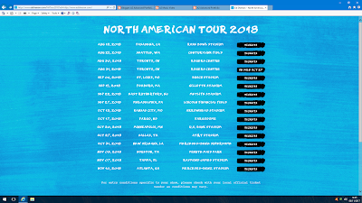
These are screen grabs from Ed Sheeran's website, you can see from these images the synergy with the colour blue and black. You can also see that the text is the same throughout the website as well as on the album covers. There are also divide signs within the merchandise images and this again is synergy as this sign is also on the album cover. The same font is also used on the website, the album cover and within the music video, this is another example of synergy within his work.
This is the teaser trailer for Ed's new album 'Divide' the key features that you can see form this trailer are the colours which are going to be sued throughout so again this shows good synergy and how he has been consistent with this. Also you can see the divide symbol which is used on the album cover and which represents the album. Also within this teaser trailer you can see the lyrics to some of the songs within the album. The best key feature is Ed himself holding a sign saying when the music is being released, this would have made more of an audience as it was him himself therefore more fans would have liked and watched this trailer and would have spreaded the word more about his album coming out and would have bought it or pre ordered it.
This is one of Ed's album covers, as you can see the divide sign is used again within this and also the same shade of blue and black is used again. By using the same colours and symbols throughout his website and album covers, this shows the unity of his brand. I think that the most important element on this album cover is the divide symbol, mainly because the album is called divide therefore it links in with that, then the album is blue and black which is the main colours throughout all of his videos, website and album cover.


